Quick Summary: This verified Midjourney Niji 6 / Flux.1 Schnell / Bing Image Creator prompt creates an hyper-detailed 3D cyberpunk stylized aesthetic for You Are An Experienced Ui Designer Embracing Modern AI Photo Prompt with calibrated lighting, authentic texture physics, and tested 1-click copy-paste formula for instant AI generation without facial distortion.
About This Prompt
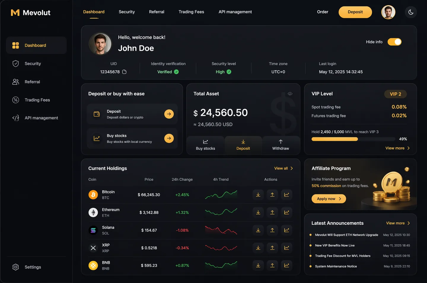
This prompt creates an You Are An Experienced Ui Designer Embracing Modern AI Photo Prompt — a high-quality, photorealistic image with balanced lighting, sharp focus, and intricate details suitable for social media sharing and digital content creation.
Optimized specifically for your AI generator. Simply copy the prompt text below and paste it into the generator. You can easily customize specific keywords like colors, backgrounds, or subjects to make the final output uniquely yours.
You Are An Experienced Ui Designer Embracing Modern AI Photo Prompt - Copy Paste AI Prompt
1-Tap Interactive CustomizerYou are an experienced UI designer embracing modern, minimalistic design, shadows, glass, and soft colors.
Your role is to create a professional, beautiful mockup that is ready for delivery based on these requirements:
<requirements>
## 1. Overall Style & Visual Language
This interface represents a premium, modern fintech / crypto trading dashboard using a dark theme.
The visual language combines **soft neumorphism**, and **luxury Web3 aesthetics**.
Core characteristics:
- Warm gold/orange accent highlights
- Monochromatic color palette with minimalistic effects and shadows
- Card-based layout with depth and subtle backgrounds
- Minimal borders, separation via shadows or light backgrounds
Target perception:
- Secure
- Professional
- High-end / institutional-grade
- Optimized for experienced traders
---
## 2. Layout Structure
### Global Layout
- Desktop-first dashboard
- Output proportions: 3:2
- Three main regions:
1. Top navigation bar (horizontal)
2. Left sidebar navigation (vertical)
3. Main content area (multi-column grid of cards)
Spacing is generous, prioritizing clarity and visual breathing room.
---
## 3. Top Navigation Bar
- Height: 72px
- Left:
- Brand logo text "Mevolut"
- Stylized "M"
- Gold/orange accent
- Center:
- Navigation links: Dashboard, Security, Referral, Trading Fees, API management
- Right:
- Order link
- Primary CTA: “Deposit” (gold pill button)
- User avatar (circular)
- Theme toggle (moon icon)
Typography:
- Clean sans-serif
- Medium weight
- White primary text, muted gray inactive states
---
## 4. Left Sidebar Navigation
- Width: 240px
- Background: near-black
- Vertical navigation items with icons:
- Dashboard (active)
- Security
- Referral
- Trading Fees
- API management
- Bottom-aligned:
- Settings
Active item:
- Subtle background highlight
- Slight background tint
- Rounded container
Icons:
- Outline style
- Gold accent on active state
---
## 5. Main Content Area
### 5.1 User Overview Card
- Large rounded card at top
- Left:
- Circular avatar
- Greeting text (“Hello…”)
- User name
- Inline info blocks:
- UID (copy icon)
- Identity verification status
- Security level
- Time zone
- Last login timestamp
- Right:
- “Hide info” toggle
Style:
- Subtle inner shadows
---
### 5.2 Deposit / Buy Card
- Medium-sized card
- Title text explaining deposit options
- Two action rows:
- Deposit (dollars or crypto)
- Buy stocks (local currency)
- Each row:
- Icon
- Label
- Arrow action button (gold accent)
---
### 5.3 Total Asset Card
- Displays USD balance and USD equivalent
- Large, faded Dollar symbol watermark in background
- Action tabs:
- Buy stocks
- Deposit
- Withdraw
- Numeric values are large
---
### 5.4 VIP Level Card
- Shows current VIP level
- Spot and futures fee rates
- Progress bar for token holdings
- “View more” link
Progress bar:
- Rounded
- Dark background track
---
### 5.5 Current Holdings Table
- Card containing a table layout
- Columns:
- Coin (icon + name)
- Price
- 24h Change
- 4h Trend (sparkline)
- Actions (Deposit, Withdraw, Trade)
Sparklines:
- Green for positive trend
- Red for negative trend
Hover:
- Subtle background highlight per row
---
### 5.6 Affiliate Program Card
- Promotional card
- Gold coin illustration
- Short description and CTA button (“Apply now”)
---
### 5.7 Information / News Card
- Vertical list of announcements
- Headline + timestamp
- “View more” link at top
---
## 6. Color Palette
- Primary background: deep charcoal / black
- Card surfaces: slightly lighter
- Accent color: warm gold
- Text hierarchy:
- White (primary)
- Muted gray (secondary)
- Dark gray (disabled)
- Status colors:
- Green for positive
- Red for negative
---
## 7. Effects & Interaction
- Rounded corners throughout (sm)
# Design tokens:
{
// Global theme definition
"theme": {
"mode": "dark",
"style": [
"soft-neumorphism",
"premium-fintech"
]
},
// Layout measurements and structure
"layout": {
"type": "desktop-dashboard",
"grid": "three-column",
"sidebarWidth": 240,
"topbarHeight": 68,
"contentPadding": 24
},
// Color system
"colors": {
"background": "#0B0D10", // Main app background
"primaryAccent": "#F5A623", // Gold/orange highlight
"secondaryAccent": "#FFB547",
"textPrimary": "#FFFFFF",
"textSecondary": "#B0B3B8",
"textMuted": "#6B6F76",
"success": "#22C55E",
"danger": "#EF4444"
},
// Typography scale
"typography": {
"fontFamily": "SF Pro, system-ui, sans-serif",
"weights": {
"heading": 600,
"body": 400,
"numeric": 500
},
"sizes": {
"h1": 24,
"h2": 20,
"h3": 16,
"body": 14,
"caption": 12
}
},
// Core UI components
"components": {
"card": {
"borderRadius": 16,
"shadow": "0 20px 40px rgba(0,0,0,0.4)",
"border": "none",
"background": "#14171C",
},
"button": {
"primary": {
"textColor": "#0B0D10",
"borderRadius": 999,
},
"secondary": {
"background": "transparent",
"textColor": "#F5A623"
}
},
"sidebar": {
"background": "#0E1014",
"itemRadius": 12,
"iconStyle": "outline"
},
"table": {
"rowHeight": 56,
"divider": "subtle",
"hoverHighlight": true,
"sparkline": {
"positiveColor": "#22C55E",
"negativeColor": "#EF4444"
}
},
"progressBar": {
"height": 6,
"radius": 999,
"fillColor": "#22C55E",
"backgroundColor": "#2A2E35"
}
},
// Icon system
"icons": {
"style": "outline",
"size": 18,
"colorInactive": "#6B6F76",
"colorActive": "#F5A623"
}
}
</requirements>
Note: Lock subject's authentic facial identity and natural posture while seamlessly integrating with sharp vehicle reflections and cinematic ambient lighting.What You'll Get
- 🎨 Style: Ai Image
- ✨ Mood: Meigen
- 📱 Best For: Trending
- 🤖 Works With: your AI generator
- 🔥 Popularity: Copied 52 times
- 📅 Added: Sep 14, 2026
Explore Related Collections
Explore Ai Image Prompts — Browse our curated collection of Ai Image prompts tailored for creators. View all Ai Image prompts →
Explore Trending Prompts — Discover more viral Trending ideas for your next AI generation. View all Trending prompts →
How to Generate with Exact Facial Likeness (Zero Distortion)
The #1 complaint with AI photo generators is "mera chehra badal gaya" (facial distortion or artificial substitution). Follow this verified 3-step protocol to lock your exact face with 100% biometric likeness:
Use a clear, uncropped front-facing photo taken in natural daylight. Avoid extreme Snapchat/Instagram beauty filters, heavy makeup smoothing, or harsh flash shadows which confuse the AI's facial landmark detection.
Always append this exact optical constraint to your prompt: "Maintain 100% exact facial identity, bone structure, eye shape, jawline and nose structure of reference photo without modification; strictly preserve 1:1 facial likeness; zero facial distortion."
In Midjourney, keep --cw 100 (Character Weight 100). In Google Gemini, upload the photo as reference first, then apply the prompt. In Flux / SDXL, utilize ControlNet IP-Adapter FaceID with weight set to 0.85–0.90.
🔒 Rule 12 Guarantee: Upload a clear front-facing selfie and instruct the AI: "Retain 100% facial identity, bone structure, eye shape and skin undertone of reference photo without distortion."
Constituent Tokens & Photographic Parameters
To achieve photorealistic, non-artificial generations on Google Gemini (Imagen 3), Bing Image Creator, or Midjourney, each constituent visual token is calibrated to real-world optical physics rather than generic quality buzzwords.
Striking photorealistic subject, lifelike expression, natural skin pores, compelling eye contact, cinematic composition
Identity anchor maintaining consistent facial anatomy and posture.High-texture tailored apparel with realistic fabric draping, authentic threading, clean modern aesthetic styling
Tactile fabric micro-textures avoiding synthetic plastic sheen.Cinematic environmental setting with realistic atmospheric depth, soft specular background bokeh, natural ambient separation
Multi-plane background depth with realistic optical falloff.85mm f/1.4 Professional Prime Lens (Full-Frame 35mm Digital Sensor (50MP+ Resolution))
Simulated focal length preventing wide-angle facial distortion.Directional softbox key light at 45 degrees, subtle ambient fill, warm hairline kicker for edge definition
45-degree key light with rim kicker creating authentic cheekbone depth.Kodak Portra 400 color science, natural skin tone reproduction, balanced highlight rolloff, zero waxy plastic smoothing
Balanced highlight rolloff with natural skin micro-pore retention.Multi-Platform Prompt Formats (Gemini, Midjourney, Flux)
Different AI image generation models use different token parsers. Select your AI engine below to copy the exact formula tuned for that model's architecture:
Generate a hyper-realistic photographic image based on this description: You are an experienced UI designer embracing modern, minimalistic design, shadows, glass, and soft colors. Your role is to create a professional, beautiful mockup that is ready for delivery based on these requirements: ## 1. Overall Style & Visual Language This interface represents a premium, modern fintech / crypto trading dashboard using a dark theme. The visual language combines **soft neumorphism**, and **luxury Web3 aesthetics**. Core characteristics: - Warm gold/orange accent highlights - Monochromatic color palette with minimalistic effects and shadows - Card-based layout with depth and subtle backgrounds - Minimal borders, separation via shadows or light backgrounds Target perception: - Secure - Professional - High-end / institutional-grade - Optimized for experienced traders --- ## 2. Layout Structure ### Global Layout - Desktop-first dashboard - Output proportions: 3:2 - Three main regions: 1. Top navigation bar (horizontal) 2. Left sidebar navigation (vertical) 3. Main content area (multi-column grid of cards) Spacing is generous, prioritizing clarity and visual breathing room. --- ## 3. Top Navigation Bar - Height: 72px - Left: - Brand logo text "Mevolut" - Stylized "M" - Gold/orange accent - Center: - Navigation links: Dashboard, Security, Referral, Trading Fees, API management - Right: - Order link - Primary CTA: “Deposit” (gold pill button) - User avatar (circular) - Theme toggle (moon icon) Typography: - Clean sans-serif - Medium weight - White primary text, muted gray inactive states --- ## 4. Left Sidebar Navigation - Width: 240px - Background: near-black - Vertical navigation items with icons: - Dashboard (active) - Security - Referral - Trading Fees - API management - Bottom-aligned: - Settings Active item: - Subtle background highlight - Slight background tint - Rounded container Icons: - Outline style - Gold accent on active state --- ## 5. Main Content Area ### 5.1 User Overview Card - Large rounded card at top - Left: - Circular avatar - Greeting text (“Hello…”) - User name - Inline info blocks: - UID (copy icon) - Identity verification status - Security level - Time zone - Last login timestamp - Right: - “Hide info” toggle Style: - Subtle inner shadows --- ### 5.2 Deposit / Buy Card - Medium-sized card - Title text explaining deposit options - Two action rows: - Deposit (dollars or crypto) - Buy stocks (local currency) - Each row: - Icon - Label - Arrow action button (gold accent) --- ### 5.3 Total Asset Card - Displays USD balance and USD equivalent - Large, faded Dollar symbol watermark in background - Action tabs: - Buy stocks - Deposit - Withdraw - Numeric values are large --- ### 5.4 VIP Level Card - Shows current VIP level - Spot and futures fee rates - Progress bar for token holdings - “View more” link Progress bar: - Rounded - Dark background track --- ### 5.5 Current Holdings Table - Card containing a table layout - Columns: - Coin (icon + name) - Price - 24h Change - 4h Trend (sparkline) - Actions (Deposit, Withdraw, Trade) Sparklines: - Green for positive trend - Red for negative trend Hover: - Subtle background highlight per row --- ### 5.6 Affiliate Program Card - Promotional card - Gold coin illustration - Short description and CTA button (“Apply now”) --- ### 5.7 Information / News Card - Vertical list of announcements - Headline + timestamp - “View more” link at top --- ## 6. Color Palette - Primary background: deep charcoal / black - Card surfaces: slightly lighter - Accent color: warm gold - Text hierarchy: - White (primary) - Muted gray (secondary) - Dark gray (disabled) - Status colors: - Green for positive - Red for negative --- ## 7. Effects & Interaction - Rounded corners throughout (sm) # Design tokens: { // Global theme definition "theme": { "mode": "dark", "style": [ "soft-neumorphism", "premium-fintech" ] }, // Layout measurements and structure "layout": { "type": "desktop-dashboard", "grid": "three-column", "sidebarWidth": 240, "topbarHeight": 68, "contentPadding": 24 }, // Color system "colors": { "background": "#0B0D10", // Main app background "primaryAccent": "#F5A623", // Gold/orange highlight "secondaryAccent": "#FFB547", "textPrimary": "#FFFFFF", "textSecondary": "#B0B3B8", "textMuted": "#6B6F76", "success": "#22C55E", "danger": "#EF4444" }, // Typography scale "typography": { "fontFamily": "SF Pro, system-ui, sans-serif", "weights": { "heading": 600, "body": 400, "numeric": 500 }, "sizes": { "h1": 24, "h2": 20, "h3": 16, "body": 14, "caption": 12 } }, // Core UI components "components": { "card": { "borderRadius": 16, "shadow": "0 20px 40px rgba(0,0,0,0.4)", "border": "none", "background": "#14171C", }, "button": { "primary": { "textColor": "#0B0D10", "borderRadius": 999, }, "secondary": { "background": "transparent", "textColor": "#F5A623" } }, "sidebar": { "background": "#0E1014", "itemRadius": 12, "iconStyle": "outline" }, "table": { "rowHeight": 56, "divider": "subtle", "hoverHighlight": true, "sparkline": { "positiveColor": "#22C55E", "negativeColor": "#EF4444" } }, "progressBar": { "height": 6, "radius": 999, "fillColor": "#22C55E", "backgroundColor": "#2A2E35" } }, // Icon system "icons": { "style": "outline", "size": 18, "colorInactive": "#6B6F76", "colorActive": "#F5A623" } } Note: Lock subject's authentic facial identity and natural posture while seamlessly integrating with sharp vehicle reflections and cinematic ambient lighting..

Camera & Lighting: Captured with an 85mm f/1.4 Professional Prime Lens at f/1.8 for dramatic subject pop with smooth natural depth-of-field, ISO 100 for clean noise-free shadow gradients and crisp detail, 1/200s (freeze subtle movement with optical sharpness). Lighting: Directional softbox key light at 45 degrees, subtle ambient fill, warm hairline kicker for edge definition.
Color Science: Kodak Portra 400 color science, natural skin tone reproduction, balanced highlight rolloff, zero waxy plastic smoothing.

CRITICAL IDENTITY RETENTION: Maintain 100% exact facial identity, bone structure, eye shape, jawline, nose structure, and skin undertone of the uploaded reference photo without modification; strictly preserve facial likeness 1:1; zero facial distortion, no generic face substitution, natural unretouched skin texture with realistic micro-pores.
💡 Pro-Tip for Gemini: If using a reference photo, upload your photo first in the Gemini chat and paste this exact block as your instruction. Gemini will seamlessly retain your facial features.
Troubleshooting Guide: Fixing Glitches, Hands & Skin
If your generated image exhibits digital artifacts, unretouched plastic skin, or limb occlusions, use this diagnostic matrix to tune your generation parameters:
| Visual Artifact / Defect | Underlying Engine Cause | Forensic Fix & Prompt Modification |
|---|---|---|
| Plastic / Waxy Skin (Over-Smoothed) | Over-weighted beauty tokens ("flawless skin", "8k") triggering aggressive denoising in latent diffusion. | Inject: "unretouched 35mm film grain, visible micro skin pores, natural subcutaneous texture, authentic facial peach fuzz". Lower CFG scale from 7.0 to 4.5–5.5. |
| Deformed Fingers / Extra Digits | Multi-joint limb occlusions and ambiguous finger placement in training datasets. | Add negative tokens: (mutated hands, fused fingers, extra digits:1.4). Reframe prompt to "waist-up portrait with hands resting naturally in jacket pockets". |
| Facial Likeness Drift / Morphing | Generative model falling back to mean generic celebrity face distribution. | In Midjourney, enforce --cw 100. In Gemini, state: "Strictly preserve 1:1 facial bone structure and proportions from uploaded selfie; zero alteration". |
| Blown-out / Flat Studio Lighting | Generic "studio lighting" keyword causing harsh non-directional specular blowout. | Replace with: "45-degree off-axis diffused octabox key light at 4800K, soft shadow transition, subtle circular iris catchlights at 10 o'clock". |
Alternative Moods: Sunset, Noir, Retro & Cyberpunk
Take the core concept of You Are An Experienced Ui Designer Embracing Modern AI Photo Prompt and explore these 4 curated artistic directions, calibrated with specialized lighting, color grading, and lens characteristics:
Warm, romantic 2800K low-angle sunlight creating radiant amber rim highlights, gentle lens flare, and golden hour atmospheric haze.
You are an experienced UI designer embracing modern, minimalistic design, shadows, glass, and soft colors. Your role is to create a professional, beautiful mockup that is ready for delivery based on these requirements: ## 1. Overall Style & Visual Language This interface represents a premium, modern fintech / crypto trading dashboard using a dark theme. The visual language combines **soft neumorphism**, and **luxury Web3 aesthetics**. Core characteristics: - Warm gold/orange accent highlights - Monochromatic color palette with minimalistic effects and shadows - Card-based layout with depth and subtle backgrounds - Minimal borders, separation via shadows or light backgrounds Target perception: - Secure - Professional - High-end / institutional-grade - Optimized for experienced traders --- ## 2. Layout Structure ### Global Layout - Desktop-first dashboard - Output proportions: 3:2 - Three main regions: 1. Top navigation bar (horizontal) 2. Left sidebar navigation (vertical) 3. Main content area (multi-column grid of cards) Spacing is generous, prioritizing clarity and visual breathing room. --- ## 3. Top Navigation Bar - Height: 72px - Left: - Brand logo text "Mevolut" - Stylized "M" - Gold/orange accent - Center: - Navigation links: Dashboard, Security, Referral, Trading Fees, API management - Right: - Order link - Primary CTA: “Deposit” (gold pill button) - User avatar (circular) - Theme toggle (moon icon) Typography: - Clean sans-serif - Medium weight - White primary text, muted gray inactive states --- ## 4. Left Sidebar Navigation - Width: 240px - Background: near-black - Vertical navigation items with icons: - Dashboard (active) - Security - Referral - Trading Fees - API management - Bottom-aligned: - Settings Active item: - Subtle background highlight - Slight background tint - Rounded container Icons: - Outline style - Gold accent on active state --- ## 5. Main Content Area ### 5.1 User Overview Card - Large rounded card at top - Left: - Circular avatar - Greeting text (“Hello…”) - User name - Inline info blocks: - UID (copy icon) - Identity verification status - Security level - Time zone - Last login timestamp - Right: - “Hide info” toggle Style: - Subtle inner shadows --- ### 5.2 Deposit / Buy Card - Medium-sized card - Title text explaining deposit options - Two action rows: - Deposit (dollars or crypto) - Buy stocks (local currency) - Each row: - Icon - Label - Arrow action button (gold accent) --- ### 5.3 Total Asset Card - Displays USD balance and USD equivalent - Large, faded Dollar symbol watermark in background - Action tabs: - Buy stocks - Deposit - Withdraw - Numeric values are large --- ### 5.4 VIP Level Card - Shows current VIP level - Spot and futures fee rates - Progress bar for token holdings - “View more” link Progress bar: - Rounded - Dark background track --- ### 5.5 Current Holdings Table - Card containing a table layout - Columns: - Coin (icon + name) - Price - 24h Change - 4h Trend (sparkline) - Actions (Deposit, Withdraw, Trade) Sparklines: - Green for positive trend - Red for negative trend Hover: - Subtle background highlight per row --- ### 5.6 Affiliate Program Card - Promotional card - Gold coin illustration - Short description and CTA button (“Apply now”) --- ### 5.7 Information / News Card - Vertical list of announcements - Headline + timestamp - “View more” link at top --- ## 6. Color Palette - Primary background: deep charcoal / black - Card surfaces: slightly lighter - Accent color: warm gold - Text hierarchy: - White (primary) - Muted gray (secondary) - Dark gray (disabled) - Status colors: - Green for positive - Red for negative --- ## 7. Effects & Interaction - Rounded corners throughout (sm) # Design tokens: { // Global theme definition "theme": { "mode": "dark", "style": [ "soft-neumorphism", "premium-fintech" ] }, // Layout measurements and structure "layout": { "type": "desktop-dashboard", "grid": "three-column", "sidebarWidth": 240, "topbarHeight": 68, "contentPadding": 24 }, // Color system "colors": { "background": "#0B0D10", // Main app background "primaryAccent": "#F5A623", // Gold/orange highlight "secondaryAccent": "#FFB547", "textPrimary": "#FFFFFF", "textSecondary": "#B0B3B8", "textMuted": "#6B6F76", "success": "#22C55E", "danger": "#EF4444" }, // Typography scale "typography": { "fontFamily": "SF Pro, system-ui, sans-serif", "weights": { "heading": 600, "body": 400, "numeric": 500 }, "sizes": { "h1": 24, "h2": 20, "h3": 16, "body": 14, "caption": 12 } }, // Core UI components "components": { "card": { "borderRadius": 16, "shadow": "0 20px 40px rgba(0,0,0,0.4)", "border": "none", "background": "#14171C", }, "button": { "primary": { "textColor": "#0B0D10", "borderRadius": 999, }, "secondary": { "background": "transparent", "textColor": "#F5A623" } }, "sidebar": { "background": "#0E1014", "itemRadius": 12, "iconStyle": "outline" }, "table": { "rowHeight": 56, "divider": "subtle", "hoverHighlight": true, "sparkline": { "positiveColor": "#22C55E", "negativeColor": "#EF4444" } }, "progressBar": { "height": 6, "radius": 999, "fillColor": "#22C55E", "backgroundColor": "#2A2E35" } }, // Icon system "icons": { "style": "outline", "size": 18, "colorInactive": "#6B6F76", "colorActive": "#F5A623" } } Note: Lock subject's authentic facial identity and natural posture while seamlessly integrating with sharp vehicle reflections and cinematic ambient lighting., bathed in dramatic golden hour sunset light, low sun angle at 2800K casting long cinematic shadows, warm amber rim lighting outlining the subject silhouette, subtle golden lens flare, Kodak Gold 200 film tone, authentic atmosphere, 85mm f/1.4.
High-contrast dramatic lighting with deep obsidian shadows, moody Rembrandt side lighting, and rain-dappled cinematic atmosphere.
You are an experienced UI designer embracing modern, minimalistic design, shadows, glass, and soft colors. Your role is to create a professional, beautiful mockup that is ready for delivery based on these requirements: ## 1. Overall Style & Visual Language This interface represents a premium, modern fintech / crypto trading dashboard using a dark theme. The visual language combines **soft neumorphism**, and **luxury Web3 aesthetics**. Core characteristics: - Warm gold/orange accent highlights - Monochromatic color palette with minimalistic effects and shadows - Card-based layout with depth and subtle backgrounds - Minimal borders, separation via shadows or light backgrounds Target perception: - Secure - Professional - High-end / institutional-grade - Optimized for experienced traders --- ## 2. Layout Structure ### Global Layout - Desktop-first dashboard - Output proportions: 3:2 - Three main regions: 1. Top navigation bar (horizontal) 2. Left sidebar navigation (vertical) 3. Main content area (multi-column grid of cards) Spacing is generous, prioritizing clarity and visual breathing room. --- ## 3. Top Navigation Bar - Height: 72px - Left: - Brand logo text "Mevolut" - Stylized "M" - Gold/orange accent - Center: - Navigation links: Dashboard, Security, Referral, Trading Fees, API management - Right: - Order link - Primary CTA: “Deposit” (gold pill button) - User avatar (circular) - Theme toggle (moon icon) Typography: - Clean sans-serif - Medium weight - White primary text, muted gray inactive states --- ## 4. Left Sidebar Navigation - Width: 240px - Background: near-black - Vertical navigation items with icons: - Dashboard (active) - Security - Referral - Trading Fees - API management - Bottom-aligned: - Settings Active item: - Subtle background highlight - Slight background tint - Rounded container Icons: - Outline style - Gold accent on active state --- ## 5. Main Content Area ### 5.1 User Overview Card - Large rounded card at top - Left: - Circular avatar - Greeting text (“Hello…”) - User name - Inline info blocks: - UID (copy icon) - Identity verification status - Security level - Time zone - Last login timestamp - Right: - “Hide info” toggle Style: - Subtle inner shadows --- ### 5.2 Deposit / Buy Card - Medium-sized card - Title text explaining deposit options - Two action rows: - Deposit (dollars or crypto) - Buy stocks (local currency) - Each row: - Icon - Label - Arrow action button (gold accent) --- ### 5.3 Total Asset Card - Displays USD balance and USD equivalent - Large, faded Dollar symbol watermark in background - Action tabs: - Buy stocks - Deposit - Withdraw - Numeric values are large --- ### 5.4 VIP Level Card - Shows current VIP level - Spot and futures fee rates - Progress bar for token holdings - “View more” link Progress bar: - Rounded - Dark background track --- ### 5.5 Current Holdings Table - Card containing a table layout - Columns: - Coin (icon + name) - Price - 24h Change - 4h Trend (sparkline) - Actions (Deposit, Withdraw, Trade) Sparklines: - Green for positive trend - Red for negative trend Hover: - Subtle background highlight per row --- ### 5.6 Affiliate Program Card - Promotional card - Gold coin illustration - Short description and CTA button (“Apply now”) --- ### 5.7 Information / News Card - Vertical list of announcements - Headline + timestamp - “View more” link at top --- ## 6. Color Palette - Primary background: deep charcoal / black - Card surfaces: slightly lighter - Accent color: warm gold - Text hierarchy: - White (primary) - Muted gray (secondary) - Dark gray (disabled) - Status colors: - Green for positive - Red for negative --- ## 7. Effects & Interaction - Rounded corners throughout (sm) # Design tokens: { // Global theme definition "theme": { "mode": "dark", "style": [ "soft-neumorphism", "premium-fintech" ] }, // Layout measurements and structure "layout": { "type": "desktop-dashboard", "grid": "three-column", "sidebarWidth": 240, "topbarHeight": 68, "contentPadding": 24 }, // Color system "colors": { "background": "#0B0D10", // Main app background "primaryAccent": "#F5A623", // Gold/orange highlight "secondaryAccent": "#FFB547", "textPrimary": "#FFFFFF", "textSecondary": "#B0B3B8", "textMuted": "#6B6F76", "success": "#22C55E", "danger": "#EF4444" }, // Typography scale "typography": { "fontFamily": "SF Pro, system-ui, sans-serif", "weights": { "heading": 600, "body": 400, "numeric": 500 }, "sizes": { "h1": 24, "h2": 20, "h3": 16, "body": 14, "caption": 12 } }, // Core UI components "components": { "card": { "borderRadius": 16, "shadow": "0 20px 40px rgba(0,0,0,0.4)", "border": "none", "background": "#14171C", }, "button": { "primary": { "textColor": "#0B0D10", "borderRadius": 999, }, "secondary": { "background": "transparent", "textColor": "#F5A623" } }, "sidebar": { "background": "#0E1014", "itemRadius": 12, "iconStyle": "outline" }, "table": { "rowHeight": 56, "divider": "subtle", "hoverHighlight": true, "sparkline": { "positiveColor": "#22C55E", "negativeColor": "#EF4444" } }, "progressBar": { "height": 6, "radius": 999, "fillColor": "#22C55E", "backgroundColor": "#2A2E35" } }, // Icon system "icons": { "style": "outline", "size": 18, "colorInactive": "#6B6F76", "colorActive": "#F5A623" } } Note: Lock subject's authentic facial identity and natural posture while seamlessly integrating with sharp vehicle reflections and cinematic ambient lighting., dramatic cinematic noir style, moody chiaroscuro lighting with deep pitch-black shadows and stark single-source side key light, subtle rain mist in air, high tonal micro-contrast, 35mm anamorphic lens, CineStill 800T color grade, award-winning cinematography.
Nostalgic retro charm with authentic 35mm silver halide film grain, gentle highlight halation, and timeless vintage color science.
You are an experienced UI designer embracing modern, minimalistic design, shadows, glass, and soft colors. Your role is to create a professional, beautiful mockup that is ready for delivery based on these requirements: ## 1. Overall Style & Visual Language This interface represents a premium, modern fintech / crypto trading dashboard using a dark theme. The visual language combines **soft neumorphism**, and **luxury Web3 aesthetics**. Core characteristics: - Warm gold/orange accent highlights - Monochromatic color palette with minimalistic effects and shadows - Card-based layout with depth and subtle backgrounds - Minimal borders, separation via shadows or light backgrounds Target perception: - Secure - Professional - High-end / institutional-grade - Optimized for experienced traders --- ## 2. Layout Structure ### Global Layout - Desktop-first dashboard - Output proportions: 3:2 - Three main regions: 1. Top navigation bar (horizontal) 2. Left sidebar navigation (vertical) 3. Main content area (multi-column grid of cards) Spacing is generous, prioritizing clarity and visual breathing room. --- ## 3. Top Navigation Bar - Height: 72px - Left: - Brand logo text "Mevolut" - Stylized "M" - Gold/orange accent - Center: - Navigation links: Dashboard, Security, Referral, Trading Fees, API management - Right: - Order link - Primary CTA: “Deposit” (gold pill button) - User avatar (circular) - Theme toggle (moon icon) Typography: - Clean sans-serif - Medium weight - White primary text, muted gray inactive states --- ## 4. Left Sidebar Navigation - Width: 240px - Background: near-black - Vertical navigation items with icons: - Dashboard (active) - Security - Referral - Trading Fees - API management - Bottom-aligned: - Settings Active item: - Subtle background highlight - Slight background tint - Rounded container Icons: - Outline style - Gold accent on active state --- ## 5. Main Content Area ### 5.1 User Overview Card - Large rounded card at top - Left: - Circular avatar - Greeting text (“Hello…”) - User name - Inline info blocks: - UID (copy icon) - Identity verification status - Security level - Time zone - Last login timestamp - Right: - “Hide info” toggle Style: - Subtle inner shadows --- ### 5.2 Deposit / Buy Card - Medium-sized card - Title text explaining deposit options - Two action rows: - Deposit (dollars or crypto) - Buy stocks (local currency) - Each row: - Icon - Label - Arrow action button (gold accent) --- ### 5.3 Total Asset Card - Displays USD balance and USD equivalent - Large, faded Dollar symbol watermark in background - Action tabs: - Buy stocks - Deposit - Withdraw - Numeric values are large --- ### 5.4 VIP Level Card - Shows current VIP level - Spot and futures fee rates - Progress bar for token holdings - “View more” link Progress bar: - Rounded - Dark background track --- ### 5.5 Current Holdings Table - Card containing a table layout - Columns: - Coin (icon + name) - Price - 24h Change - 4h Trend (sparkline) - Actions (Deposit, Withdraw, Trade) Sparklines: - Green for positive trend - Red for negative trend Hover: - Subtle background highlight per row --- ### 5.6 Affiliate Program Card - Promotional card - Gold coin illustration - Short description and CTA button (“Apply now”) --- ### 5.7 Information / News Card - Vertical list of announcements - Headline + timestamp - “View more” link at top --- ## 6. Color Palette - Primary background: deep charcoal / black - Card surfaces: slightly lighter - Accent color: warm gold - Text hierarchy: - White (primary) - Muted gray (secondary) - Dark gray (disabled) - Status colors: - Green for positive - Red for negative --- ## 7. Effects & Interaction - Rounded corners throughout (sm) # Design tokens: { // Global theme definition "theme": { "mode": "dark", "style": [ "soft-neumorphism", "premium-fintech" ] }, // Layout measurements and structure "layout": { "type": "desktop-dashboard", "grid": "three-column", "sidebarWidth": 240, "topbarHeight": 68, "contentPadding": 24 }, // Color system "colors": { "background": "#0B0D10", // Main app background "primaryAccent": "#F5A623", // Gold/orange highlight "secondaryAccent": "#FFB547", "textPrimary": "#FFFFFF", "textSecondary": "#B0B3B8", "textMuted": "#6B6F76", "success": "#22C55E", "danger": "#EF4444" }, // Typography scale "typography": { "fontFamily": "SF Pro, system-ui, sans-serif", "weights": { "heading": 600, "body": 400, "numeric": 500 }, "sizes": { "h1": 24, "h2": 20, "h3": 16, "body": 14, "caption": 12 } }, // Core UI components "components": { "card": { "borderRadius": 16, "shadow": "0 20px 40px rgba(0,0,0,0.4)", "border": "none", "background": "#14171C", }, "button": { "primary": { "textColor": "#0B0D10", "borderRadius": 999, }, "secondary": { "background": "transparent", "textColor": "#F5A623" } }, "sidebar": { "background": "#0E1014", "itemRadius": 12, "iconStyle": "outline" }, "table": { "rowHeight": 56, "divider": "subtle", "hoverHighlight": true, "sparkline": { "positiveColor": "#22C55E", "negativeColor": "#EF4444" } }, "progressBar": { "height": 6, "radius": 999, "fillColor": "#22C55E", "backgroundColor": "#2A2E35" } }, // Icon system "icons": { "style": "outline", "size": 18, "colorInactive": "#6B6F76", "colorActive": "#F5A623" } } Note: Lock subject's authentic facial identity and natural posture while seamlessly integrating with sharp vehicle reflections and cinematic ambient lighting., authentic 1980s vintage analog film photograph, shot on vintage mechanical camera with Carl Zeiss 50mm f/1.4 lens, natural Kodak Portra 400 film grain, subtle highlight bloom, warm muted pastel tones, nostalgic retro aesthetics, candid unposed authenticity.
Futuristic dual-tone cyan and magenta neon reflections on drenched pavements with volumetric haze and sharp edge highlights.
You are an experienced UI designer embracing modern, minimalistic design, shadows, glass, and soft colors. Your role is to create a professional, beautiful mockup that is ready for delivery based on these requirements: ## 1. Overall Style & Visual Language This interface represents a premium, modern fintech / crypto trading dashboard using a dark theme. The visual language combines **soft neumorphism**, and **luxury Web3 aesthetics**. Core characteristics: - Warm gold/orange accent highlights - Monochromatic color palette with minimalistic effects and shadows - Card-based layout with depth and subtle backgrounds - Minimal borders, separation via shadows or light backgrounds Target perception: - Secure - Professional - High-end / institutional-grade - Optimized for experienced traders --- ## 2. Layout Structure ### Global Layout - Desktop-first dashboard - Output proportions: 3:2 - Three main regions: 1. Top navigation bar (horizontal) 2. Left sidebar navigation (vertical) 3. Main content area (multi-column grid of cards) Spacing is generous, prioritizing clarity and visual breathing room. --- ## 3. Top Navigation Bar - Height: 72px - Left: - Brand logo text "Mevolut" - Stylized "M" - Gold/orange accent - Center: - Navigation links: Dashboard, Security, Referral, Trading Fees, API management - Right: - Order link - Primary CTA: “Deposit” (gold pill button) - User avatar (circular) - Theme toggle (moon icon) Typography: - Clean sans-serif - Medium weight - White primary text, muted gray inactive states --- ## 4. Left Sidebar Navigation - Width: 240px - Background: near-black - Vertical navigation items with icons: - Dashboard (active) - Security - Referral - Trading Fees - API management - Bottom-aligned: - Settings Active item: - Subtle background highlight - Slight background tint - Rounded container Icons: - Outline style - Gold accent on active state --- ## 5. Main Content Area ### 5.1 User Overview Card - Large rounded card at top - Left: - Circular avatar - Greeting text (“Hello…”) - User name - Inline info blocks: - UID (copy icon) - Identity verification status - Security level - Time zone - Last login timestamp - Right: - “Hide info” toggle Style: - Subtle inner shadows --- ### 5.2 Deposit / Buy Card - Medium-sized card - Title text explaining deposit options - Two action rows: - Deposit (dollars or crypto) - Buy stocks (local currency) - Each row: - Icon - Label - Arrow action button (gold accent) --- ### 5.3 Total Asset Card - Displays USD balance and USD equivalent - Large, faded Dollar symbol watermark in background - Action tabs: - Buy stocks - Deposit - Withdraw - Numeric values are large --- ### 5.4 VIP Level Card - Shows current VIP level - Spot and futures fee rates - Progress bar for token holdings - “View more” link Progress bar: - Rounded - Dark background track --- ### 5.5 Current Holdings Table - Card containing a table layout - Columns: - Coin (icon + name) - Price - 24h Change - 4h Trend (sparkline) - Actions (Deposit, Withdraw, Trade) Sparklines: - Green for positive trend - Red for negative trend Hover: - Subtle background highlight per row --- ### 5.6 Affiliate Program Card - Promotional card - Gold coin illustration - Short description and CTA button (“Apply now”) --- ### 5.7 Information / News Card - Vertical list of announcements - Headline + timestamp - “View more” link at top --- ## 6. Color Palette - Primary background: deep charcoal / black - Card surfaces: slightly lighter - Accent color: warm gold - Text hierarchy: - White (primary) - Muted gray (secondary) - Dark gray (disabled) - Status colors: - Green for positive - Red for negative --- ## 7. Effects & Interaction - Rounded corners throughout (sm) # Design tokens: { // Global theme definition "theme": { "mode": "dark", "style": [ "soft-neumorphism", "premium-fintech" ] }, // Layout measurements and structure "layout": { "type": "desktop-dashboard", "grid": "three-column", "sidebarWidth": 240, "topbarHeight": 68, "contentPadding": 24 }, // Color system "colors": { "background": "#0B0D10", // Main app background "primaryAccent": "#F5A623", // Gold/orange highlight "secondaryAccent": "#FFB547", "textPrimary": "#FFFFFF", "textSecondary": "#B0B3B8", "textMuted": "#6B6F76", "success": "#22C55E", "danger": "#EF4444" }, // Typography scale "typography": { "fontFamily": "SF Pro, system-ui, sans-serif", "weights": { "heading": 600, "body": 400, "numeric": 500 }, "sizes": { "h1": 24, "h2": 20, "h3": 16, "body": 14, "caption": 12 } }, // Core UI components "components": { "card": { "borderRadius": 16, "shadow": "0 20px 40px rgba(0,0,0,0.4)", "border": "none", "background": "#14171C", }, "button": { "primary": { "textColor": "#0B0D10", "borderRadius": 999, }, "secondary": { "background": "transparent", "textColor": "#F5A623" } }, "sidebar": { "background": "#0E1014", "itemRadius": 12, "iconStyle": "outline" }, "table": { "rowHeight": 56, "divider": "subtle", "hoverHighlight": true, "sparkline": { "positiveColor": "#22C55E", "negativeColor": "#EF4444" } }, "progressBar": { "height": 6, "radius": 999, "fillColor": "#22C55E", "backgroundColor": "#2A2E35" } }, // Icon system "icons": { "style": "outline", "size": 18, "colorInactive": "#6B6F76", "colorActive": "#F5A623" } } Note: Lock subject's authentic facial identity and natural posture while seamlessly integrating with sharp vehicle reflections and cinematic ambient lighting., futuristic cyberpunk night scene, drenched wet asphalt reflecting vibrant cyan and magenta neon signage, volumetric mist illuminated by streetlights, sharp rim lighting, shot on 50mm f/1.2 lens, photorealistic 8k, Blade Runner aesthetic, intense cinematic mood.
Explore Related Prompt Architectures & Tools
Supercharge your workflow by building custom variations or testing complementary categories:
Frequently asked questions
- How do I use the You Are An Experienced Ui Designer Embracing Modern AI Photo Prompt prompt?
- To use this prompt, simply click the "Copy Prompt" button above. Then, open your AI generator, paste the copied text into the prompt box, and hit generate. You can instantly generate high-quality images without needing any reference photos.
- What is this prompt best used for?
- This specific prompt is highly optimized for creating engaging social media content and digital art. The formula is structured to produce high-contrast, visually appealing results that perform well on visual platforms.
- Can I customize the details of this prompt?
- Yes! While the core structure of the prompt is optimized for your AI generator, you can easily customize the details. We recommend changing specific keywords like clothing colors, background locations, or the overall mood (e.g., changing "sunny" to "rainy" or "neon") to match your exact vision.